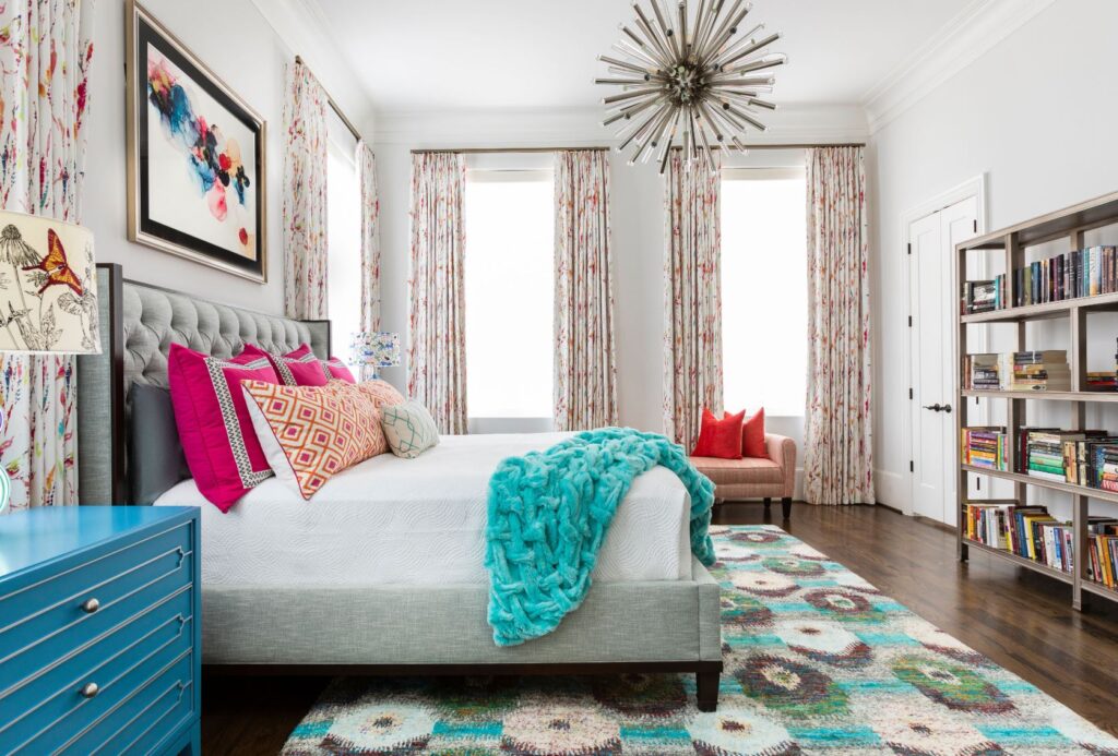
When the painter Wassily Kandinsky said that “color is a power which directly influences the soul,” he was speaking of his art but the sentiment holds true for interior design as well. Colors, patterns and prints are a way for us to make a statement in our homes that reflect our sensibilities. Neutral colors may be calming, but they can sometimes be a bit, well, boring.
As Laurie Pressman, vice president of the Pantone Color Institute, told Veranda magazine, people are favoring bold colors, used in unexpected ways.
“It’s all about our desire for creative expression,” Pressman said. “Understanding that our surroundings influence our mental health, many are expressing their creativity in the home as a way to enhance their feelings of joyfulness and well-being.”
Some are even calling it “Dopamine Dressing”. Think of patterns and prints as another way to add both interest and harmony to a home. The way that the elements in wallpaper, flooring or fabrics repeat in recognizable arrangements is satisfying. Mixing and matching these patterns just takes things a step further. If you need more reasons to revel in colors, patterns, and prints this year, consider the following.
Add Texture and Depth
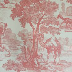
While neutral tones can help unify a room, they can also render it a little flat. Adding different colors and patterns can help to add texture and depth to a room. Think about the play between stripes and florals or plaids and damask. Bold stripes and soft florals can provide an interesting contrast, while a homey plaid and the more formal damask show patterning with two different sides of tradition.
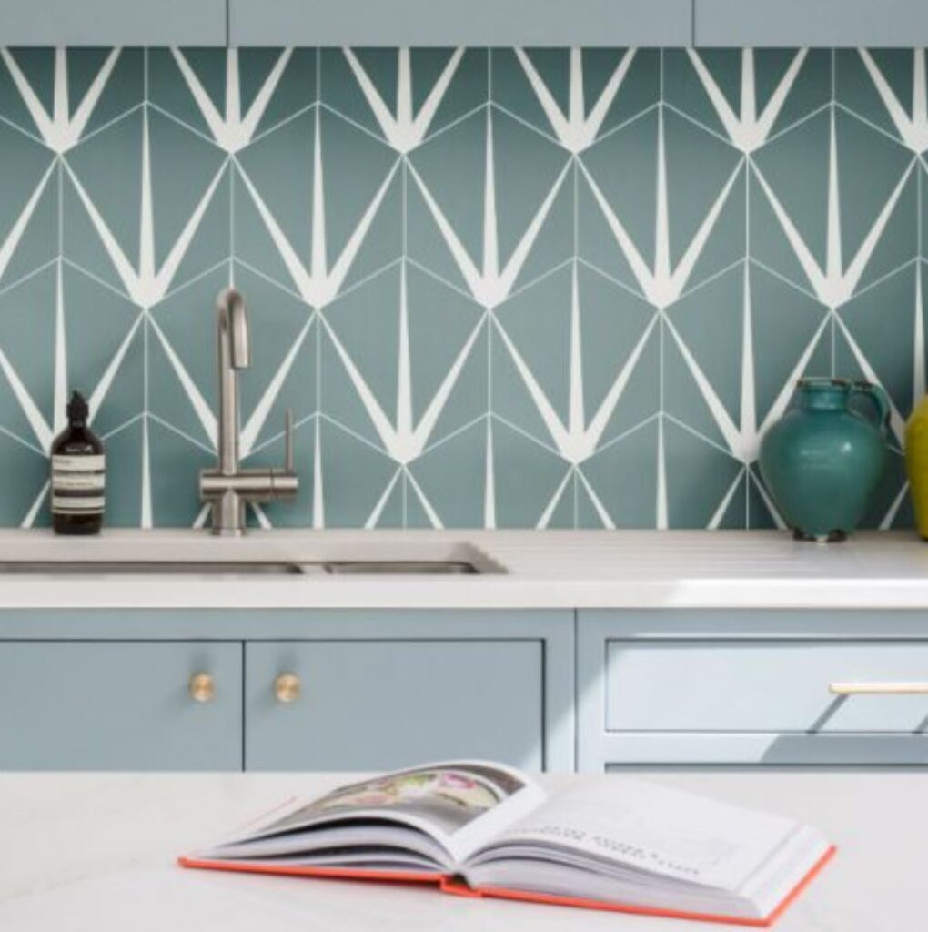
Rugs, walls, curtains, and upholstery are all ways to layer in your desired effect. Just pay attention to how it all fits together to make the space both functional and pleasing to the eye. For an idea of what’s possible, see Thibaut’s Mural Wallpaper or Ca’ Pietra’s Lily Pad Porcelain tile. We especially like the color in the Lily Pad Porcelain Eucalyptus from Ca’ Pietra, shown below.
Create a Focal Point
Sometimes a room will have a natural focal point, like a wall of windows to a magnificent view, but sometimes it is necessary to create one. Having something that stands out, like a piece of art, a textured accent wall, or statement upholstery helps with the visual hierarchy of the space.
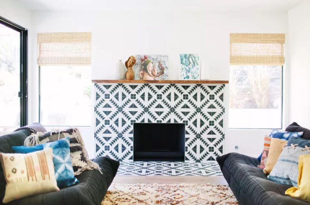
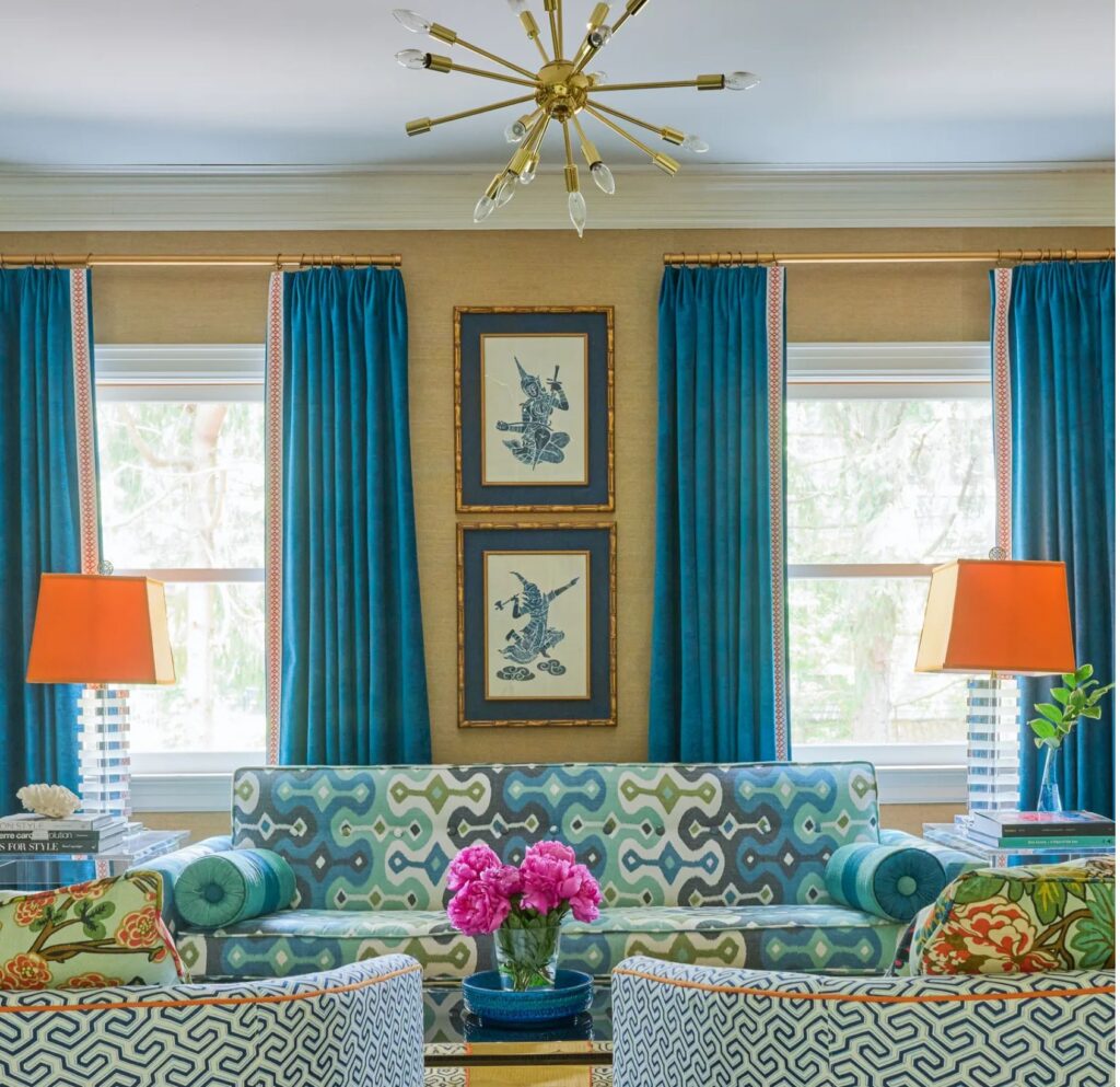
What better way to draw the eye than with a patterned cement tile fireplace (as shown above) or a cerulean blue window treatment (shown below)?
It may be the bold pattern, pop of color or that the focal point provides enough contrast to earn top billing, but echoes of the element will repeat elsewhere in the space as supporting players.
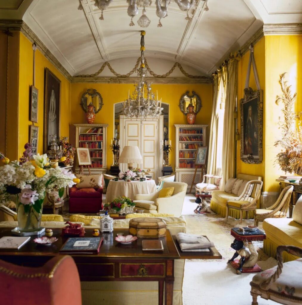
A few years ago, the New York Times Style magazine, asked interior designers to pick 25 rooms that influence design today. One of the rooms, the 1950s living room of the London flat of designer and socialite Nancy Lancaster, is a bit busy for modern tastes, but the daffodil yellow walls are a showstopper. Accent cushions, ruffle skirts and yellow roses are companions that carry the theme throughout the large space.
Enhance the Mood
It is not news that we gravitate to certain colors and prints. That is because our go-tos evoke different emotions for us and others. A room is not just a space. It is its own little world with its own specific atmosphere. The design choices set the mood and one’s experience in the space.

Images Courtesy: Pantone & Benjamin Moore
Veranda magazine talked to some tastemakers to see what they thought the color zeitgeist would be in 2023. For Pantone, the color of the year is Viva Magenta (above). Andrea Magno, color marketing director at Benjamin Moore, told the magazine that their choice is “Raspberry Blush.”
“For 2023, we sensed a yearning for bold, saturated color and a shift toward colors that are a bit unexpected, especially after several years of neutrals and muted hues taking center stage,” says Magno.
That’s not to say that there aren’t milder shades that can still provide the right splash of color. Jewel tones and acidic greens also made Veranda’s list. Even the neutral option—Sherwin-Williams’ Redend Point—has a fair bit of mauve.
Break up Large Spaces
In large spaces it is even more essential to add color, pattern, and prints that can break up the room, create visual interest and establish a more intimate environment. Using different colors to carve out distinct spaces is one option. An accent wall painted in a vivid color or covered in a natural leaf fiber can anchor a section.
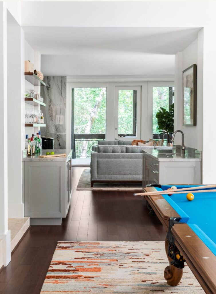
Area rugs can also be used to create a room within a room. In the next example at right, we grounded the pool table area with one rug and sectioned off the living area with another rug, all while keeping the open floorplan.
The bolder the better to draw attention to distinct zones. A faux cowhide or geometric jute are also fun options. Revival Rugs, a vintage rug startup recently featured in Architectural Digest, has a number of ideas at a good price point.
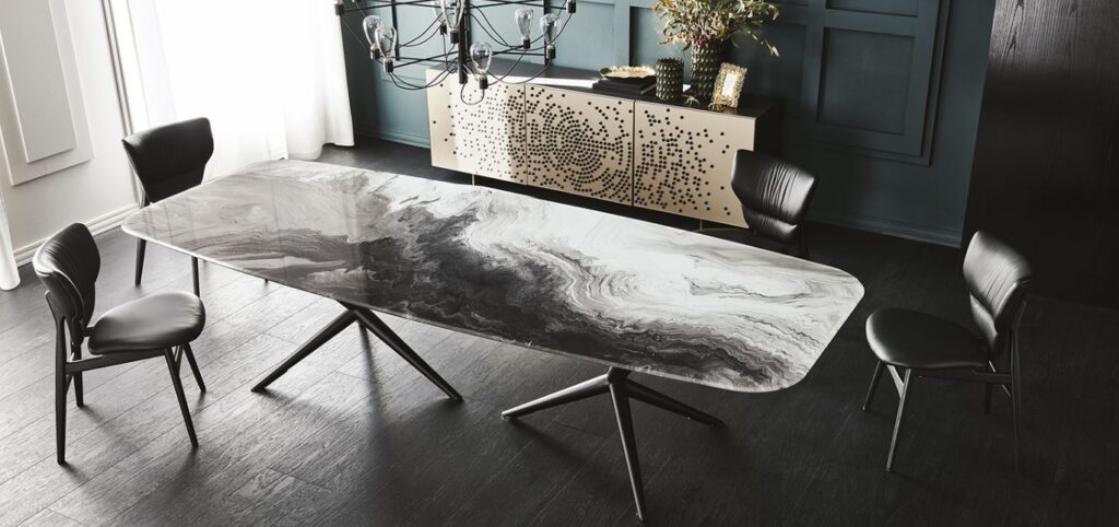
Furniture with unique patterns and fabric in well-defined groupings are another element that works well in creating mini-rooms. Take a look at Cattelan’s Atlantis Crystal Art Table or House Beautiful’s round up of accent chairs for inspiration.
Not only is using color and pattern strategically a sure-fire way to create visual interest and express your personal style, it is also a lot of fun. With so many options available, you can play with different combinations and see what works for you.
Whether you want to create a warm and inviting living room or a futuristic workspace, color and pattern can help you achieve your desired mood.
As designer David Hicks says, “The best rooms have something to say about the people who live in them.”
Let us capture your personality with color, pattern and print. Contact us today.
