Photo Courtesy: BenchMade Modern and Living Cozy
In ancient Egypt, green symbolized rebirth. Maybe that’s why green was a common color for wedding gowns in the 16th century. It is the color of spring, verdant grass and new buds on barren trees. In interior design, green is favored because it is calming, natural, luxurious and easy to combine with other colors. For those looking to the outdoors for further design ideas, stone is another natural element. Materials such as alabaster and travertine have an organic feel that can add a sense of warmth and character to a space. Let’s explore more about nature for design inspiration.
A Gathering of Green
While green is the color most often associated with sustainability and the environment, it can be popular in design because of its versatility. It’s trending now because it pairs well with natural wood which is a major design focus and it works perfectly with the re-introduced earth tones. Additionally, green can be paired with a variety of other colors like pink, yellow, orange and blue, to create a fresh, modern look.
Better Homes & Gardens recently showcased all the ways that green hues could be combined with other colors to create vastly different interiors. For a modern beach bedroom, the designers blended neon green, orange and turquoise. In a more rustic country kitchen, sage green was paired with a creamy white to great effect. A restful bedroom featured mint green and indigo.

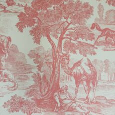
Photo Courtesy: Thibaut
Green is also handy because it works in both traditional and modern spaces. It’s just at home in a beachfront, Miami mansion as it is in a cozy mountain cabin. If the view out your window is luscious with vegetation, consider bringing some of that color indoors with emerald sisal or palm leaf wallpaper or curtains. We love the tropical feel of this Palm Botanical wallpaper from Thibaut.
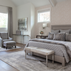
One of the welcome byproducts of decorating with green is the calming effect the color has on the mind and body. It’s actually scientifically proven. According to research, the human eye sees green more easily than any other color in the spectrum. Straining less to see green, our nervous system relaxes. In old Hollywood, actresses and actors went to an actual “green room” to decompress after working under the constant glare. You can do much the same in your own home. We incorporated soft blue-greens as accents in the following spa room for one of our favorite clients. You can’t help but to feel calm in this Zen-like space.

Décor by Pamela Hope Designs

Décor by Pamela Hope Designs
Lastly, green can have a luxurious and opulent look and feel, particularly when used in fabrics like velvet and in wallcoverings. Drapery, upholstery, wallpaper or even a throw across the back of a sofa can add richness to an overall scheme. As we’ve shared recently, we created this vibrant, upscale bathroom for a Houston-area client with gorgeous emerald wallpaper, green cabinetry and Gioia Avocado wall tile in the shower.
Timeless Travertine and Alabaster
Like the color green, alabaster and travertine are versatile options in the design world. Both have been utilized by artists for centuries. Alabaster is a fine-grained mineral that the ancient Greeks and Egyptians favored for statues and other works of art. In its natural element, alabaster is a translucent white but when heated can be made to look like marble. It can also be dyed.
Travertine is a type of porous limestone that isn’t quite as hard as marble or granite. Yet it was sturdy enough for the Romans to use as the material to build the Colosseum. Something people appreciate today about travertine is how it weathers over the years to gain a patina of antiquity.

Photo Courtesy: Atelier Alain Ellouz
Alabaster and travertine have been used on floors, countertops and walls. Consider the wow factor of the (above) 26-foot-tall back-lit alabaster wall at the Atelier Alain Ellouz in Paris. The (below) travertine kitchen island at a farmhouse in Provence is breath-taking.

Photo Courtesy: Matthieu Salvaing and AD PRO
Both materials are neutral in color, making them easy to match with other design elements in a room. They also have unique textures and patterns, which can add visual interest to a space.
Travertine’s earthy colors range from light beige and cream to warm golden hues and rich browns. Some travertine also features subtle veining or mineral deposits, but it’s not the black on white that people are used to seeing in marble. There are different finishes available with travertine too. Polished, honed, tumbled (literally putting it into a tumbler with stones), and brushed are the options. Polished is the choice for a refined look, while tumbled reflects a more rough-hewn feel. These tiles from Parvatile give you an idea of the distress that tumbling can achieve.

Photo Courtesy: Parvatile
Alabaster, once quarried, can be white to light beige with some subtle streaks of gray, brown, or yellow. Because of its softness, it is easy to carve or mold into a desired shape, like a decorative object. Alabaster’s natural translucency gives it the ability to reflect light, which can really open up a room. Allied Maker’s alabaster sconce, shown below, is a great example of using the material to its best advantage.

Photo Courtesy: Allied Maker
Of the two, travertine can handle higher levels of foot traffic and has been a popular flooring material for centuries. While it fell out of favor during the recent gray, black and white trends, it is back now and can be a nice floor option for slightly warmer-hued interiors and for those wanting a real stone material. Travertine provides a classic floor that can easily work with many interior design styles.
Alabaster is more delicate and often more expensive. We like using it on surfaces that will be back-lit for its beautiful translucency. Also, for a small touch here and there, it is pretty in light fixtures.
A Cumulative Effect
The result of combining green with natural stone in a home is a space that pays homage to nature’s gifts. Alabaster provides the luminous accents while travertine is the warm, earthy base upon which you can layer greens and other complimentary colors.
You don’t have to go all in on the trend though. Making it work for you could be as simple as tiling the fireplace with travertine or adding a few alabaster sconces to a bathroom or retreat space. Then incorporate green with a new whole sofa or just a few accent pillows. As always, Pamela Hope Designs is ready to help embrace trends while helping you to create a space as unique as you. Contact us to get started.