Top Tips for Bathroom Updates
(and a few things to avoid!)
Bathrooms, formerly called necessary rooms, are an important part of interior design. They are, of course, necessary in all homes. I remember when we lived in Virginia, my parents favored traditional design and Colonial architecture. We actually had a Victorian style sign on our powder room door that read “Necessary Room.” As kids, we found that hilarious.
As necessary as they may be, bathrooms also offer an opportunity to create comfortable, functional and attractive spaces that your family and friends will frequently use. Why not make the experience as enjoyable as possible?
Here’s a list of some of my favorite dos and a few don’ts designing bathrooms:
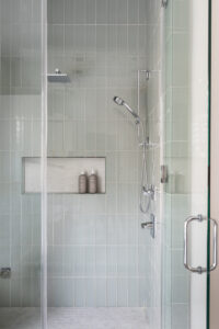
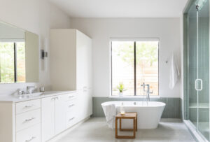
1. Think classic versus trendy in tiles. That crazy, modern tile may look cool but it’s a quick way to date stamp a bathroom. Instead, consider a classic tile in a natural stone look or light neutral color. For a little pizzazz, look for a tile in an interesting shape or texture or lay it in a fun pattern like basketweave or herringbone.
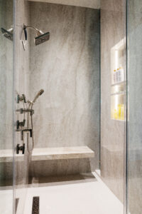
2. Create an accent wall behind the tub or around the shower. Here you can break the rules a bit, choosing something with a little more drama. However, if you stick to the classics like a neutral stone or stone-look porcelain without a heavy pattern or stark contrast, you will enjoy your bathroom for years to come.
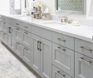
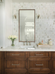
 3. Pretty, subtle countertops are the way to go. Going crazy on your countertops will look too busy. You often grow tired of that high contrast counter and wish you had dialed it back. Countertops are expensive and labor intensive to change so keep it classy with marbles with subtle veins, quartzites with quiet patterns and lightly textured neutral countertops. Whether real stone or man-made quartz options, they will provide long-term good looks.
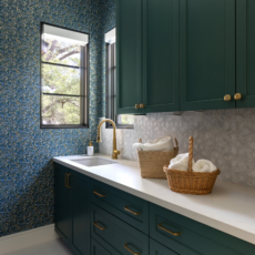
 4. Don’t underestimate white paint. Most bathroom walls honestly look best in a version of white or a light neutral. Powder rooms or a guest bath can be a little more dramatic but for everyday grooming and frequent daily use, white is an excellent choice. Keep in mind that you don’t want strong undertones washing you out or making you look like a ghoul.
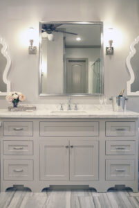 5. Be careful with cabinets. Good cabinet storage is a godsend in bathrooms. You always need a place to stash extra soap, toilet tissue, towels, etc. Again, just like with the other hard surfaces, select a quiet, soothing color. Avoid intense or bright hues. We are seeing a lot of interest in stained wood cabinetry again. It started in kitchens a few years ago and now it’s migrated to the bathroom. Although you may think it goes in and out of style, stained wood is a classic choice. For long term satisfaction, use a medium walnut or light stain on a neutral wood such as white oak.
 If you’ve enjoyed these tips, you might like checking out these earlier blogs:
Rising Interest in Updating Kitchens and Bathrooms
Adding Color and Style to Your Bathroom
We are off to our new design project.
Fondly,
Pamela Hope Designs
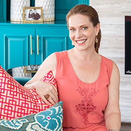
 MEET PAMELA, A LUXURY INTERIOR DESIGNER IN HOUSTON
Pamela O’Brien is the founder of Pamela Hope Designs in Houston, Texas. Pamela is an award-winning luxury interior designer, writer, and speaker. Prior to founding Pamela Hope Designs, Pamela served as a spokesperson in media and public affairs, working with media outlets like Dateline NBC and 48 Hours. This experience allowed her to travel the world and furthered her love for travel, culture, and interior design. After attending an executive course at the Harvard Graduate School of Design, Pamela launched her own interior design firm full-time. Pamela is known for building strong relationships with her clients, who later become friends and collaborators. She is highly influential in the Houston interior design space and shows no signs of slowing down.