Learn the Rules for Mixing Patterns to Create a Connected and Lively Space
Whether getting dressed in the morning or shopping for homes, many of us worry about clashing patterns. How do you mix patterns, colors, and prints for a cohesive and stylish look? When is it appropriate to break the rules and “power clash” to set you and your space apart? Our Houston interior designers love working with patterns because they bring a lively energy and personalized feeling to a room. However, we know embracing patterns for the first time can be intimidating. So, we’re sharing our 10 rules for mixing patterns to help guide you through the process.
Benefits of Mixing Patterns, Colors, and Prints
Why mix colors, patterns, and prints in the first place? Just like in your wardrobe, this practice brings added visual interest and helps showcase your personality. The top three benefits of pattern mixing include:
Personalization
Although neutrals work well as a solid base for your interior design scheme, they are just that — neutral. Incorporating colors and patterns into your space tells the story of who you are while creating a one-of-a-kind mood that can’t be copied.
Defined Focal Points
Bold accent colors and patterns catch the eye, and you can use them to draw attention to key focal points in the room. While a white fireplace box will recede into a white wall, a rich glazed emerald tile surround will stand out and highlight the feature.
Texture and Depth
An all-white room feels a little flat. However, layering patterns throughout a room helps create visual texture and depth, adding character and making the space feel more welcoming.
10 Rules for Mixing Patterns, Colors, and Prints
Ready to try your hand at pairing florals, stripes, and plaids? Here are our Houston interior design team’s 10 rules for pattern mixing to help you coordinate like a pro.
1. Collect Inspiration Images and Samples
Take some time to research and discover what colors and types of patterns appeal to you. You can begin your journey by collecting fabric and wallpaper swatches from local showrooms or perusing inspiration images on Pinterest. Look for common threads between what resonates. You may even find a pattern to ground your entire design plan!
2. Pick a Style
Patterns can range from traditional chinoiserie to preppy stripes to retro geometrics. Through your research, you will discover that certain patterns coordinate with particular looks. Picking a style will help guide your decision-making, ensuring your patterns work together in the theme.
3. Define Your Color Palette
One of the best ways to guarantee that your polka dot, stripe, and floral fabrics will coordinate is to ensure they’re all in the same color palette. Color is critical to beautiful design. No matter what colors you prefer, good use of color will enhance your interiors and make them feel more luxurious. Select a dominant, secondary, and accent color when creating your palette. Stick to neutrals for the dominant colors and have fun with bright accents. And remember, if it’s your favorite color, it’s always a classic to you.
4. Build Off a Showstopper Pattern
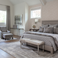
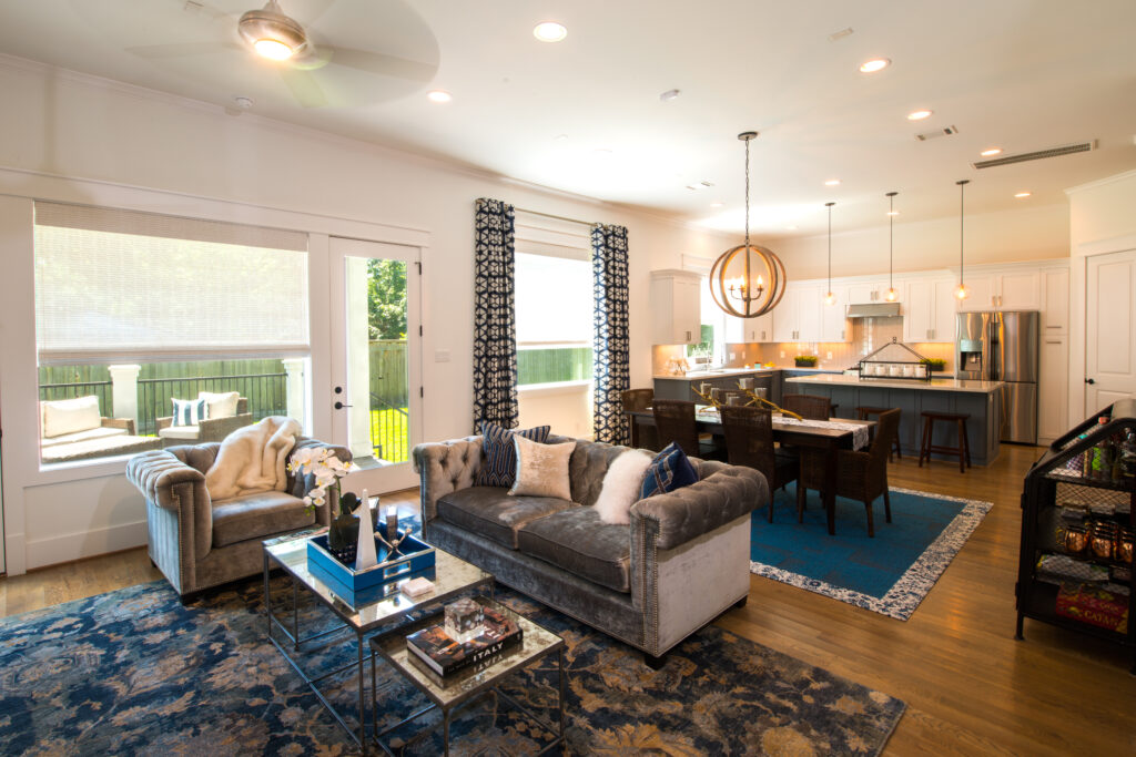
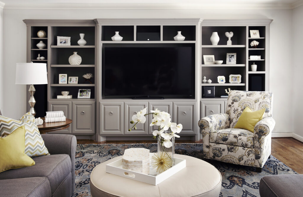
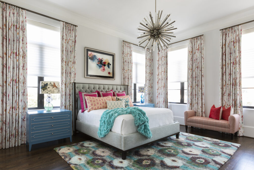
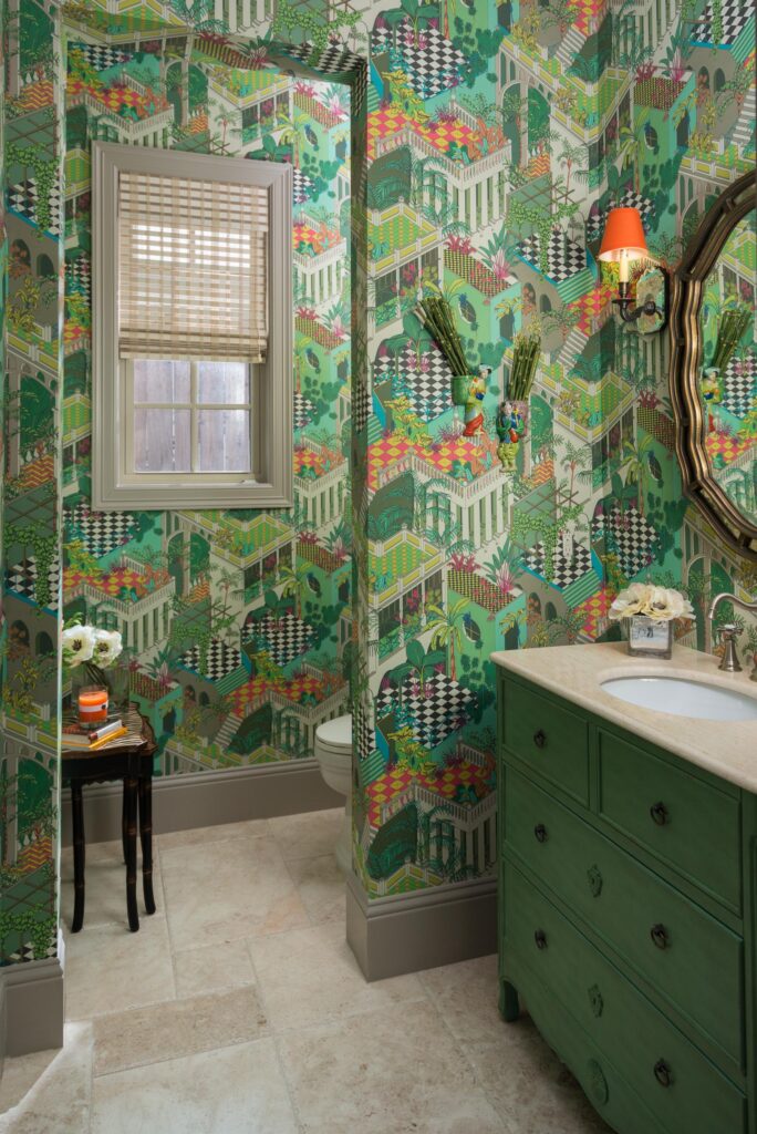
Select one pattern to be your showstopper. This large-scale pattern will have the boldest or most intricate design and be the main focal point. It could be a rug, wallpaper, or upholstery fabric. All your other patterns should build off the showstopper, drawing from the color palette and complementing without upstaging.
5. Pay Attention to Pattern Scale
Patterns can be large or small, compact or open, structured or organic. Consider these factors when pairing prints to ensure they complement rather than compete. For example, three large-scale floral patterns might feel overwhelming in a single space. However, a large-scale floral will complement nicely with a medium and small-scale print, like a wide stripe and a mini dot.
6. Contrast With Different Types of Patterns
Create interesting contrast and layers by blending different types of patterns. For example, an organic floral chintz pattern provides a lovely counterpart to a structured gingham check. Pairing seemingly opposite prints is a great way to highlight their beauty and bring balance to the overall interior design plan.
7. Decide on a Focal Point
Before covering everything in a pattern, decide where it will make the most impact. Your focal point could be a character-rich fireplace with patterned tile surround, an upholstered headboard, custom draperies to frame the view, or a bold wallpaper to wrap the space. Try to limit yourself to three patterns, assigning the showstopper print to the main focal point and relying on the others to fill in the background moments.
8. Break Up Patterns With Solids
Just because you’re embracing patterns doesn’t mean you have to forget about solids. Create some breathing room between patterns by incorporating solid elements throughout the space. For example, wainscotting can break up a wallpaper pattern, and crisp white linens allow a statement headboard to shine.
9. Get Organized With a Mood Board
There’s a lot to keep track of when working with multiple colors, patterns, and prints in a room. A mood board will help you visualize the space and see how all your elements work together before making any commitments. Plus, it will help keep your project organized and on track!
10. Don’t Be Afraid to Break the Rules
Some rules are made to be broken, even the ones we just gave to you! While all of these recommendations will help guide your project, there are exceptions to the rules of pattern mixing. For example, maximalist design themes embrace more patterns and even clashing patterns that somehow still work together. Before making rash decisions, know what rules you’re breaking and why. Every design decision should have intent.
That’s How You Mix Patterns for a Beautiful (and Cohesive) Room!
There you have it! Those are our tips for mixing paisley, stripes, plaid, houndstooth, madras, and any other pattern in your design scheme. Does all this pattern talk have you seeing stars? No worries! Our team of Houston interior designers is here to guide you through the pattern process for any room. It all starts with a consultation.